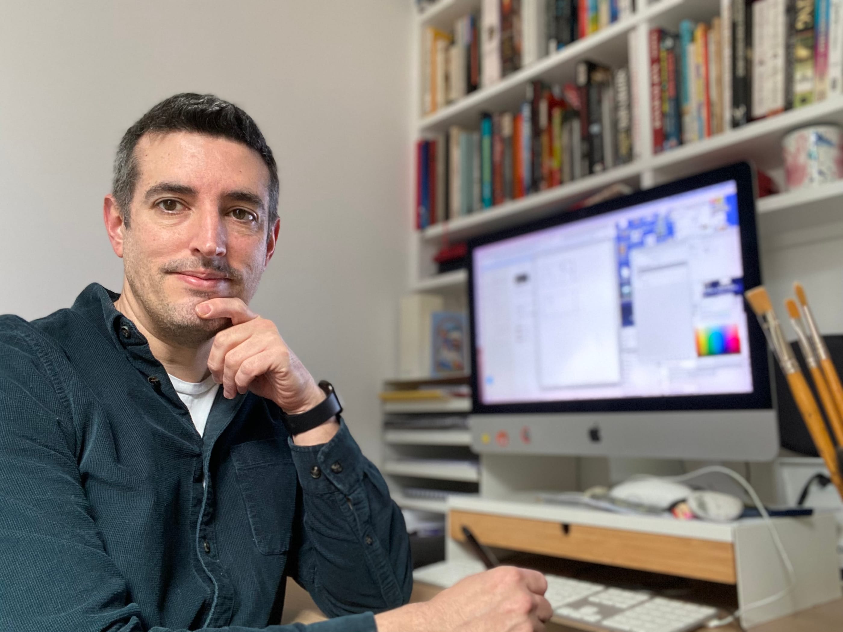
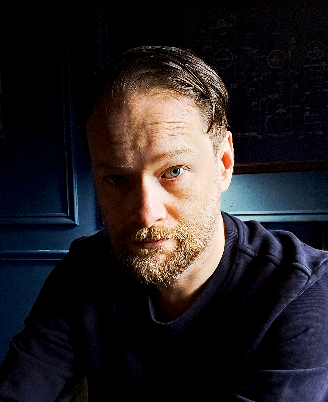
OK, we're really really getting into it this time - it's big talk with The Big Interview. Leighton Johns, illustrator, storyboard artist and close collaborator with TheNeverPress breaks down his career and journey for us.
This interview is a biggie. Why? Well, there is a ton of stuff to yap about and also because we're thinking of kicking off a series of longer form interviews where we order another round and hang out a little longer. And who better to test this format on than our in-house artist, responsible for the beautiful artwork for Maria & The Devil, Racehorse Movies Podcast and plenty more gorgeous upcoming projects you're yet to clap your eyes on. So, stick the kettle back on or rack up a couple more boiler-makers and let's go...
Leighton! Here we are and we have a ways to go so let's crack on.. May you please tell us about your illustration journey - how did it begin?
Well it started off as an animation journey really. I drew from an early age and I loved doing that, but my other big passion was cinema; I was a real film fanatic. I’d collect movie poster ads from newspapers and magazines and draw copies of them or I’d draw characters from movies I liked. Eventually I started making my own versions of posters and creating original characters and stories.
I started off just making little flick books, and then I got to do some model animation as part of my A level Art course. I was mainly teaching myself through experimentation. After that I did a three month animation course at the University of the West of England Bristol to try and get my skills up to industry standard. While at UWE I became more interested in the individual drawings that created the animation rather than the finished animation, the way that a single illustration could convey so much without movement
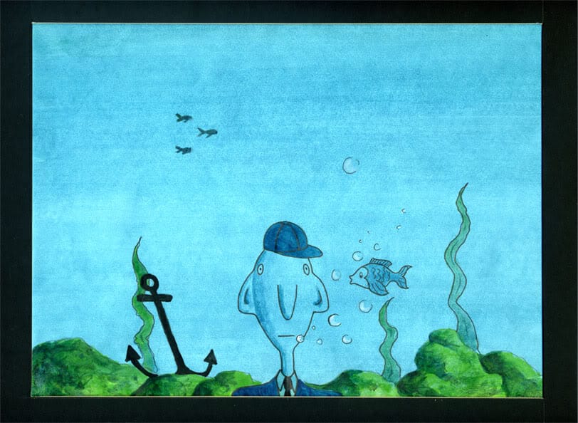
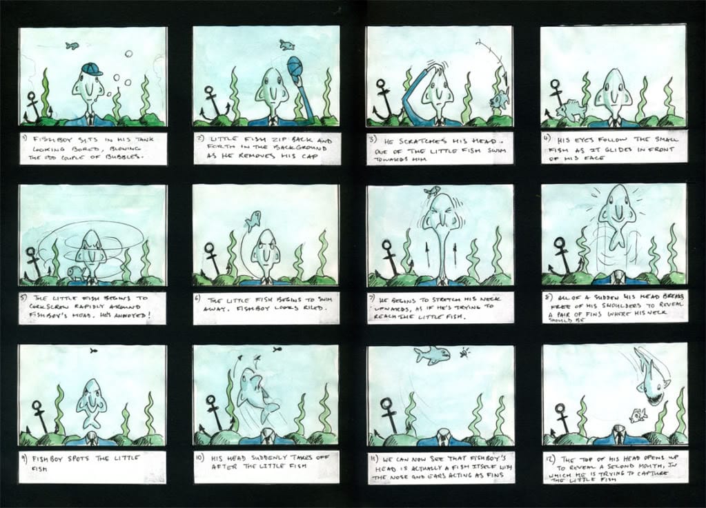
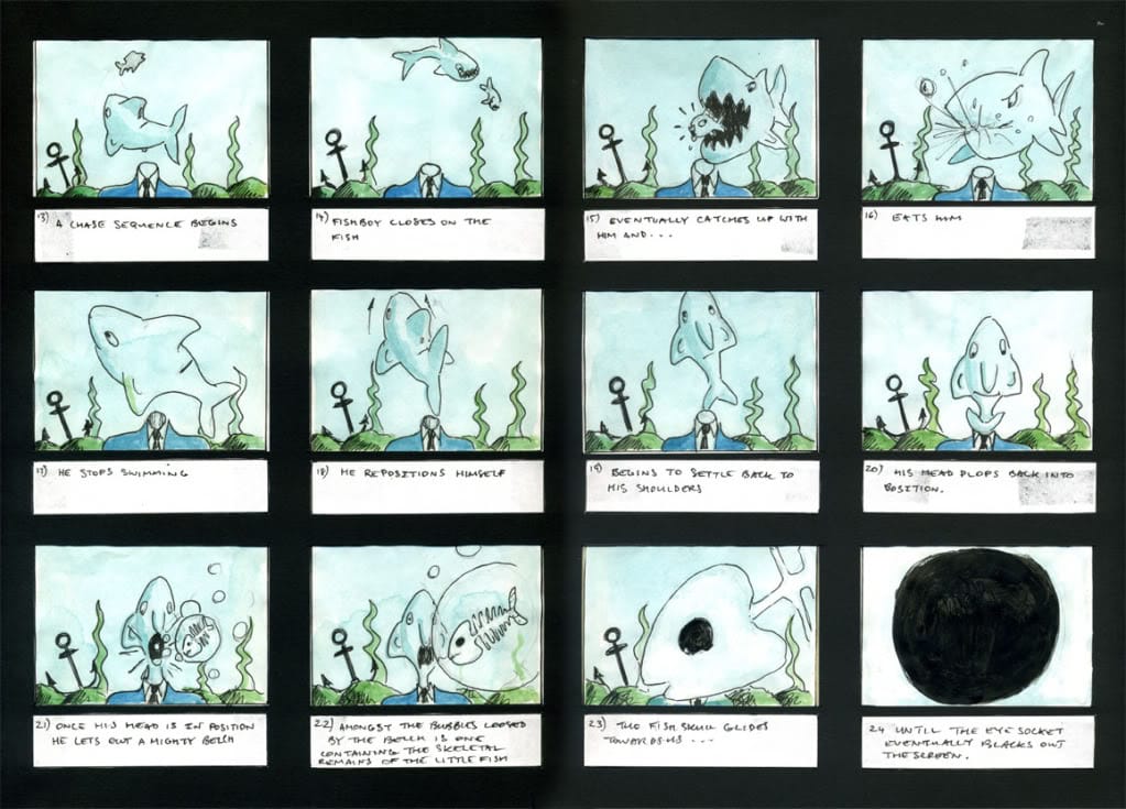
The problem I had was I wouldn’t be able to study illustration at BA or MA level, I already had a Student Loan I needed to pay off and I was now living in London, which isn’t the cheapest place to get by. I ended up getting a part time job within the Library department of The University of the Arts London. It was fantastic because I was really falling in love with the world of illustration in much the way I fell in love with cinema as a kid. Now I would listen to interviews with comic artists and illustrators like I’d previously listened to the words of famous film directors.
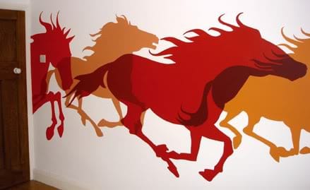
At the same time I was putting some of the techniques I was learning into practice by painting murals. I was painting characters on the walls of kids’ nurseries, the ceilings of Hospital Wards, the corridors of Schools, and building up an illustration portfolio in the process, and getting paid for it. Back then I was aiming mostly at children's publishing. I got some work appearing online, got a few bits in magazines like ImagineFX and then started to get the odd book cover commission.

Really it’s been a bit of a juggling act like that ever since. The ‘bread and butter’ stuff is the advertising visuals and storyboards, but then every now and again I’ll get contacted by someone who’s in pre-production on a film or TV series and needs concept art or storyboards to help get funding, or there may be some lovely people who need a book cover or Podcast artwork. You never quite know what’s going to land in your lap from one day to the next.
What and who are your influences and creative touchstones?
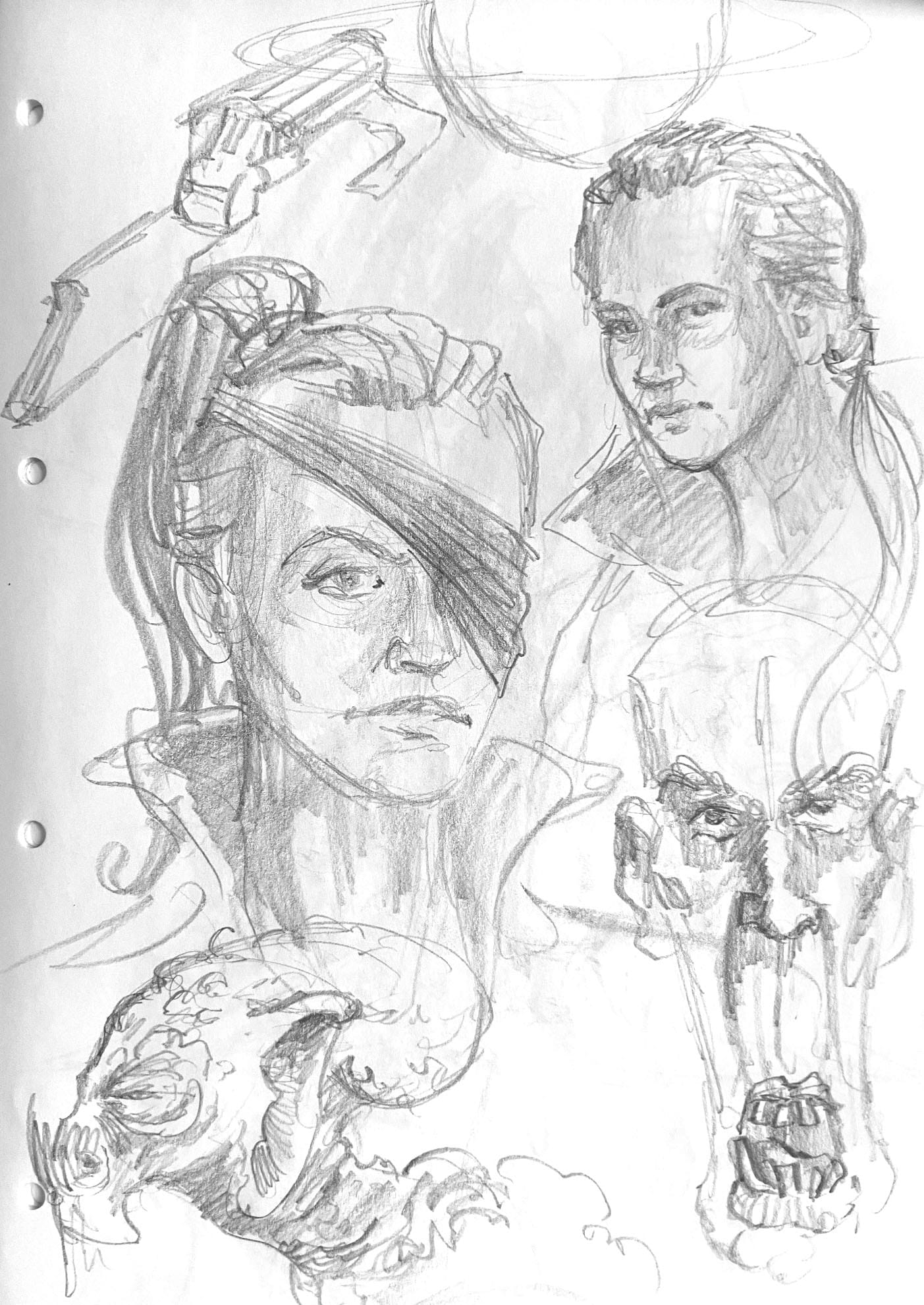
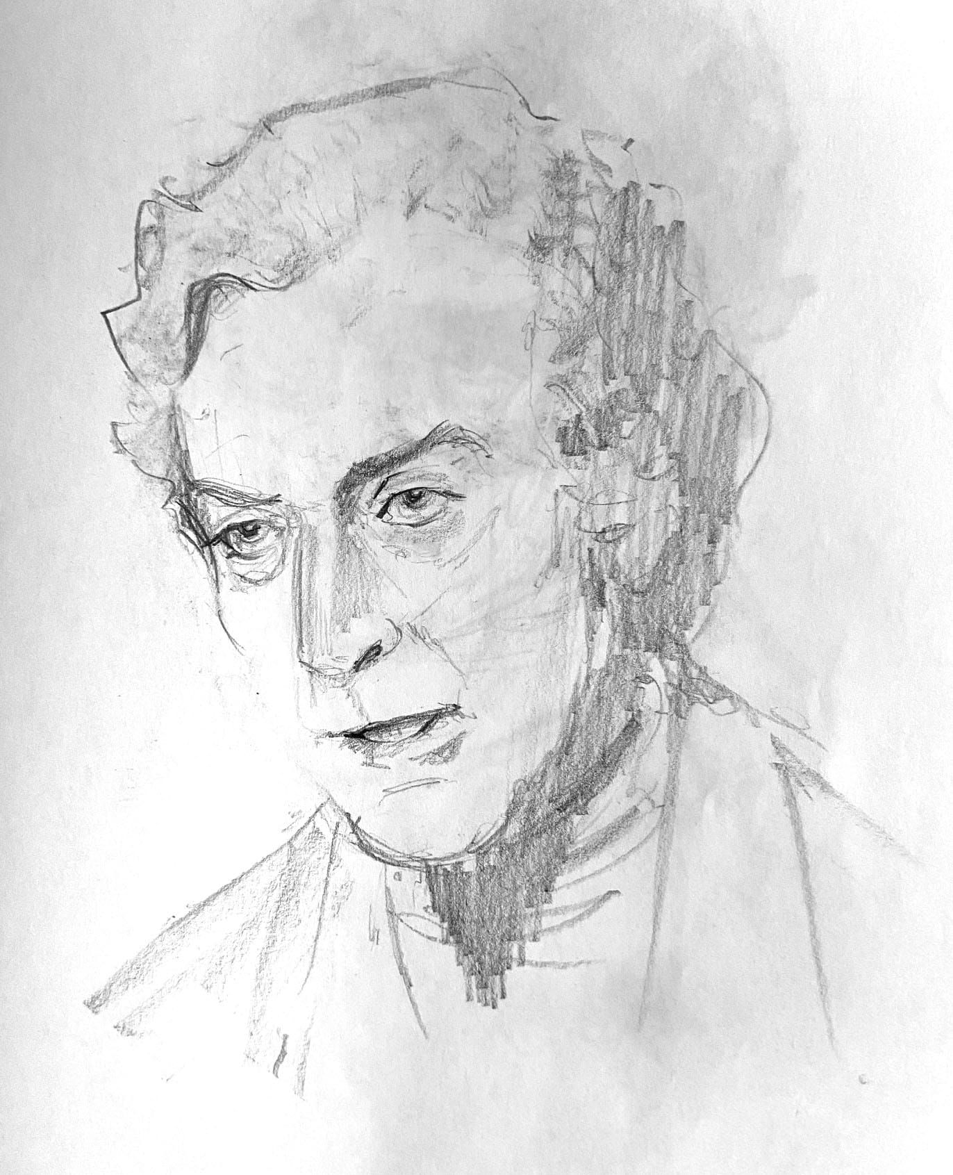
There are a ton of influences I suppose. If I’m working on a pastiche or retro inspired piece then it’s dictated by the artists of the period I’m trying to evoke. In terms of getting me to where I am today with my more personal work, it was mostly American illustrators from the 60s and 70s like Bob Peak, Bernie Fuchs and Mitchell Hooks. I especially love their drawings from that period because they are so loose, or at least have that impression. They really knew what to focus on and what to leave out.
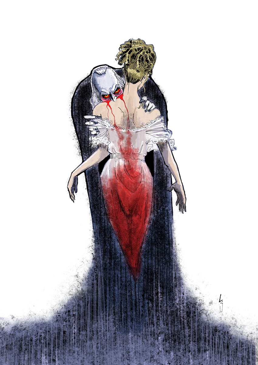
There were others doing work in a similar vein in Europe. There was an Italian comic book artist, still fairly obscure here unfortunately, named Dino Battaglia who again would break up his jagged line work, rely a lot on shadow to define form, or just hint at things. I certainly had him in mind when I worked on ‘Maria and the Devil’.
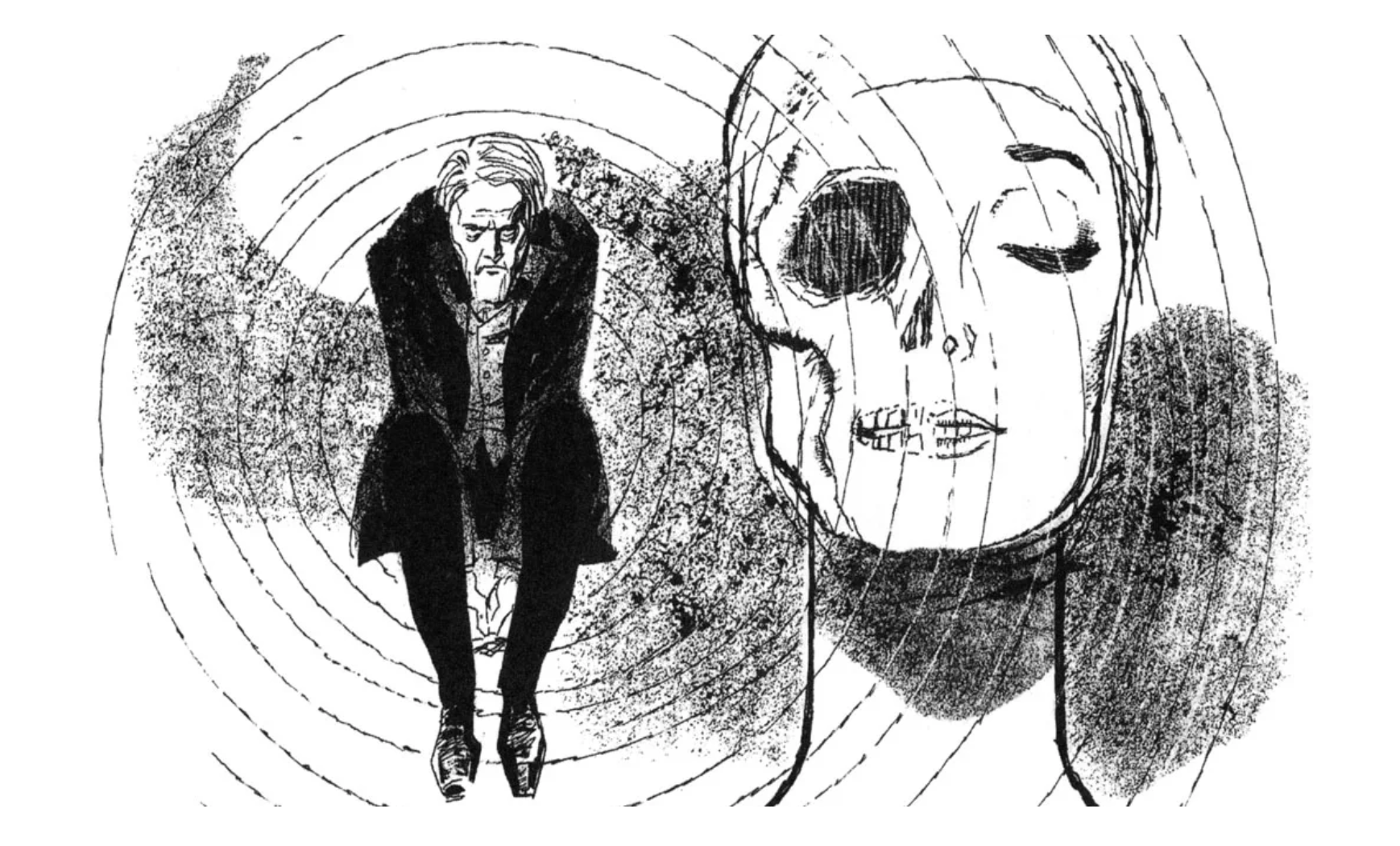
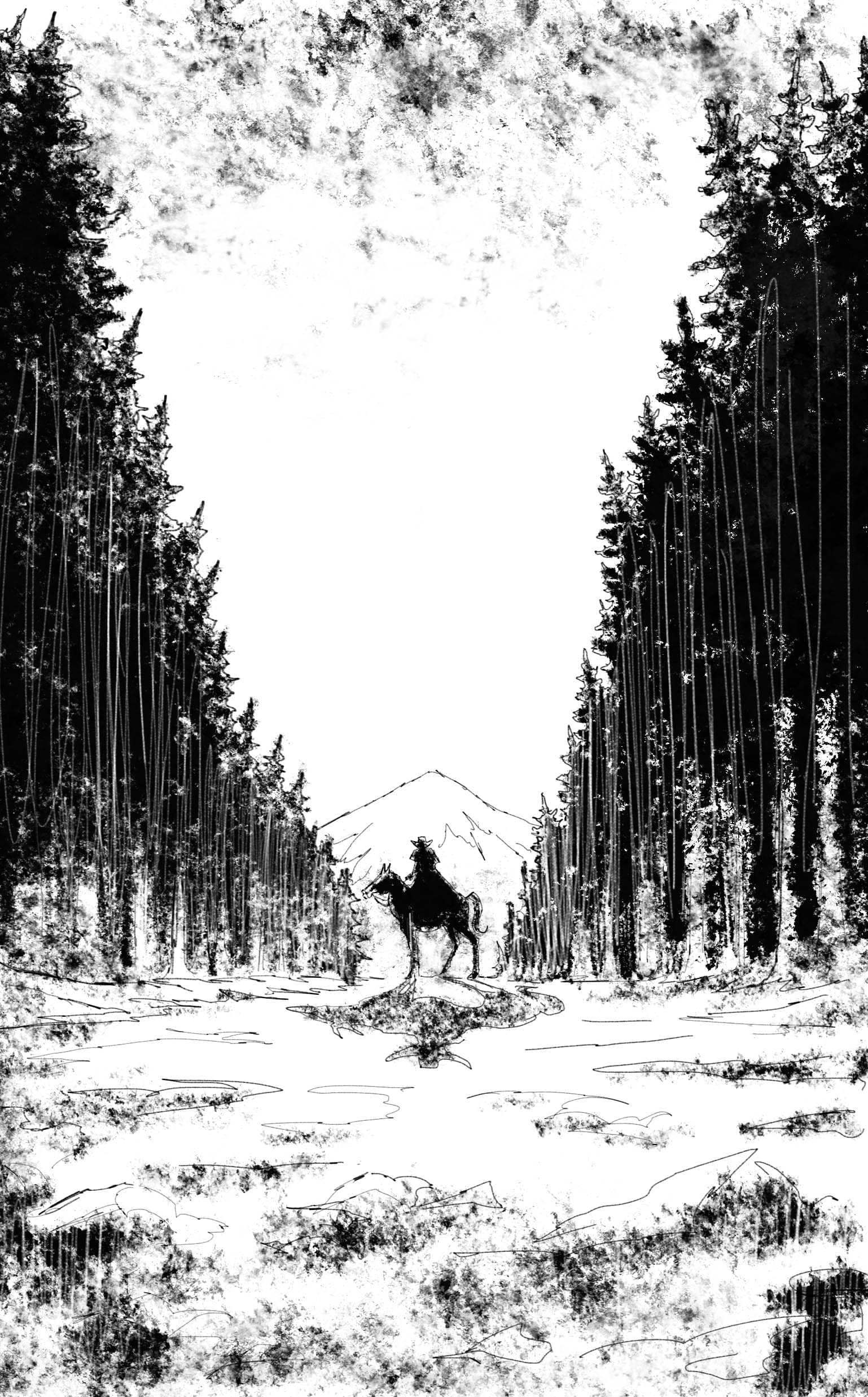
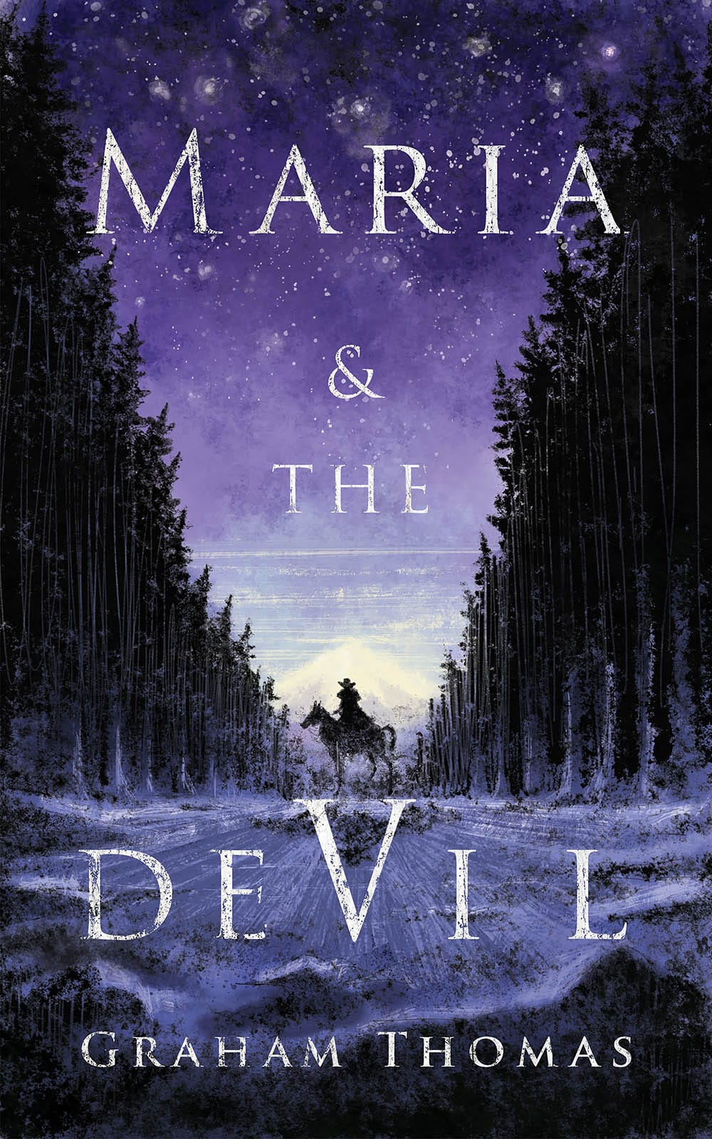
Left; Dino Battaglia, Centre and Right; Leighton Johns for TheNeverPress
These are the kind of artists I have sort of whispering in my ear when I sit down to work on something, saying things like “do you really need to include that ear?”, “Don’t worry about colouring outside the lines”, just giving me the confidence to keep things looking a bit more spontaneous.
How do you know when an illustration is finished, artistically?
On most work you reach a point where you start adding marks to the picture and you realise it's actually diminishing the thing, it’s not adding anything other than more layers of paint. As I said just now, you kind of have the ghosts of the illustrators of the past saying “Did you really need to add that last detail?”. That's a tricky thing to handle when you’re working with traditional media because you often have to step over that line to recognise it, and by that point you’ve got a big splodge of something that you now need to get rid of.
There are also times when you are just not sure if things are finished. In those cases, if it's not an urgent job I just leave it, put it out of sight and concentrate on something else and then look back at it a few days later with fresh eyes. More often than not you’ll then see things that need to be changed, or perhaps where it needs more work.
Who's work do you admire - who should we be checking out?
Well there were the illustrators of the past that I mentioned earlier who I certainly still admire. In terms of people working today Bill Sienkiewicz is definitely still right up there. Bob Peak and Bernie Fuchs were both big influences on Sienkiewicz so I guess it should be no surprise that I’d be into him. I was blown away by his graphic novels like “Love and War” and “Elektra: Assassin.” I loved his energy and kind of fearlessness for combining different media and styles, and the fact that he worked in comics where common sense said none of this should work. In one panel you’d be looking at a pencil sketch, then next would have acrylic and airbrush, the next might be a collage using electrical components. His ‘memorial’ portraits and illustration work in recent years have been amazing.
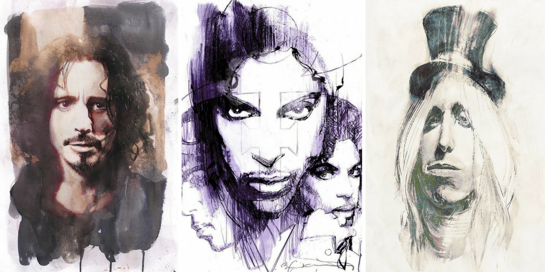
What Sienkiewicz and others did in comics in the 80s blew the doors wide open to allow other approaches to design and we are still reaping the reward of that today. There’s some wonderful work out there. I discovered Greek illustrator Dani through her work on ‘Sword and Sorcery character ‘Black Beth’.
Italy’s Gigi Cavenago is just a revelation. I first became aware of him through his covers for Dylan Dog, such an amazing combination of line and texture and colour. A lot of Dylan Dog is difficult to come by in the UK but I’ve got an English translation copy of ‘Dylan Dog: Mater Dolorosa’ where Cavenago does the interior artwork and it’s a visual triumph! Every panel is just so beautiful and full of energy.
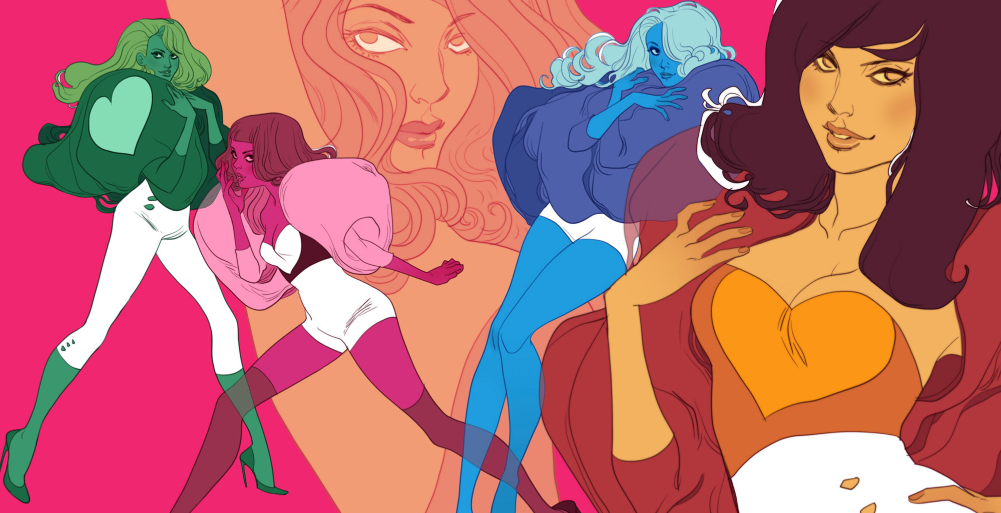
I should also mention Margueritte Sauvage who I first became a fan of when she was doing fashion and editorial illustration in the noughties. She has this wonderful style that's sort of difficult to describe, it relies heavily on traditional drawing skill but it’s not afraid of looking digital, or using flat colour. It feels retro and current, there are elements that feel like collage, but the overall impression is that you've discovered the sketch book or doodle pad of a visual genius.
What are your favourite projects to work on - is it the collaboration or the potential in the material?
It’s hard to pick a favourite type of project because I love the variety. Character design is really fun, particularly when it’s early on in a project. It's a first step, almost back of the envelope stuff so it's generally quick and no one is expecting you to get it bang-on first time. Yours is just one take on this character, there may be many more, so you don’t feel too precious about it.
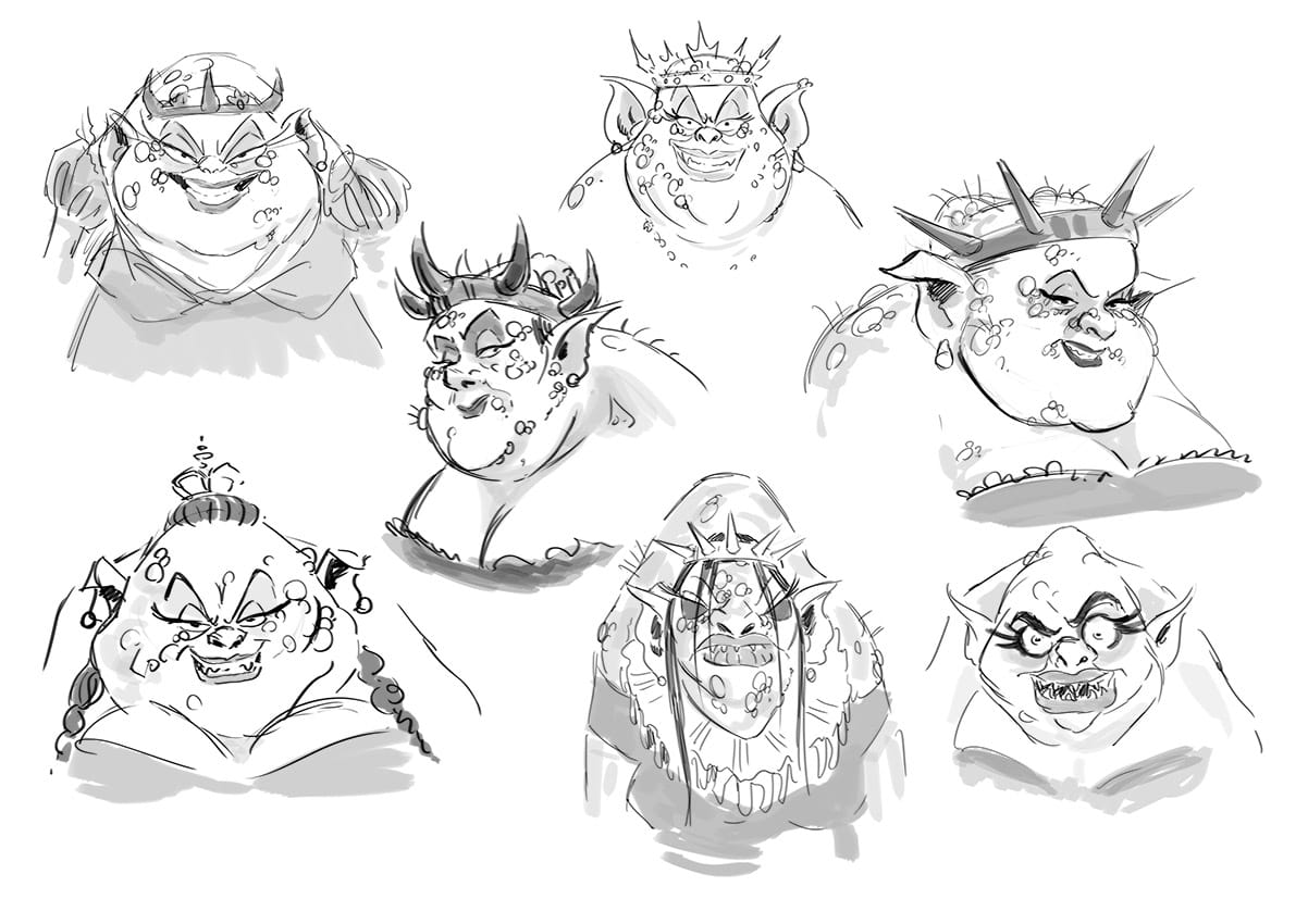
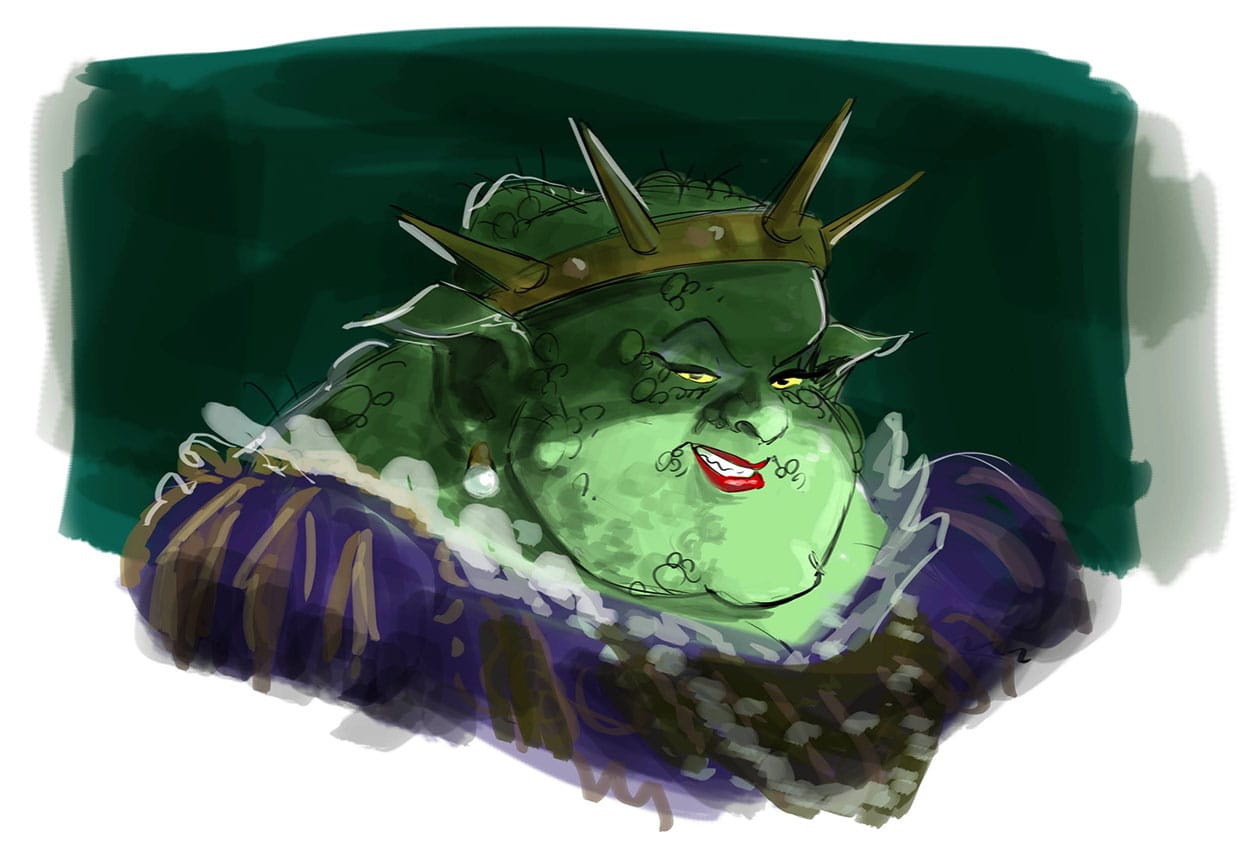
I like the communication that comes with collaboration. I read their words and respond visually, they look at my first sketch and respond with more words, usually “a little more of this”, or “a little less of that”. It’s rarely “nailed it first time” or “completely wrong” for that matter. It’s a dialogue.
Collaboration is great as long as your collaborator has confidence in their ideas and they don’t start trying to move the goalposts part way through your process, because that can be a disaster. I’m quite happy for someone to say, ‘you know what, that didn’t work, perhaps we try something else’ as long as they’ve let you finish your part of the process. If collaboration is a dialogue then that kind of thing is the equivalent of not letting you finish a sentence.
How closely do you work with directors and DoPs in laying out storyboards and scenes?
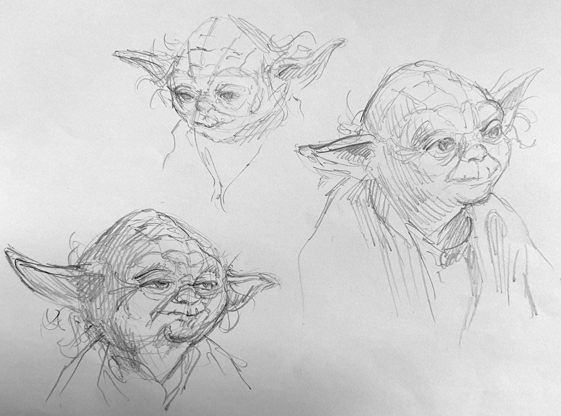
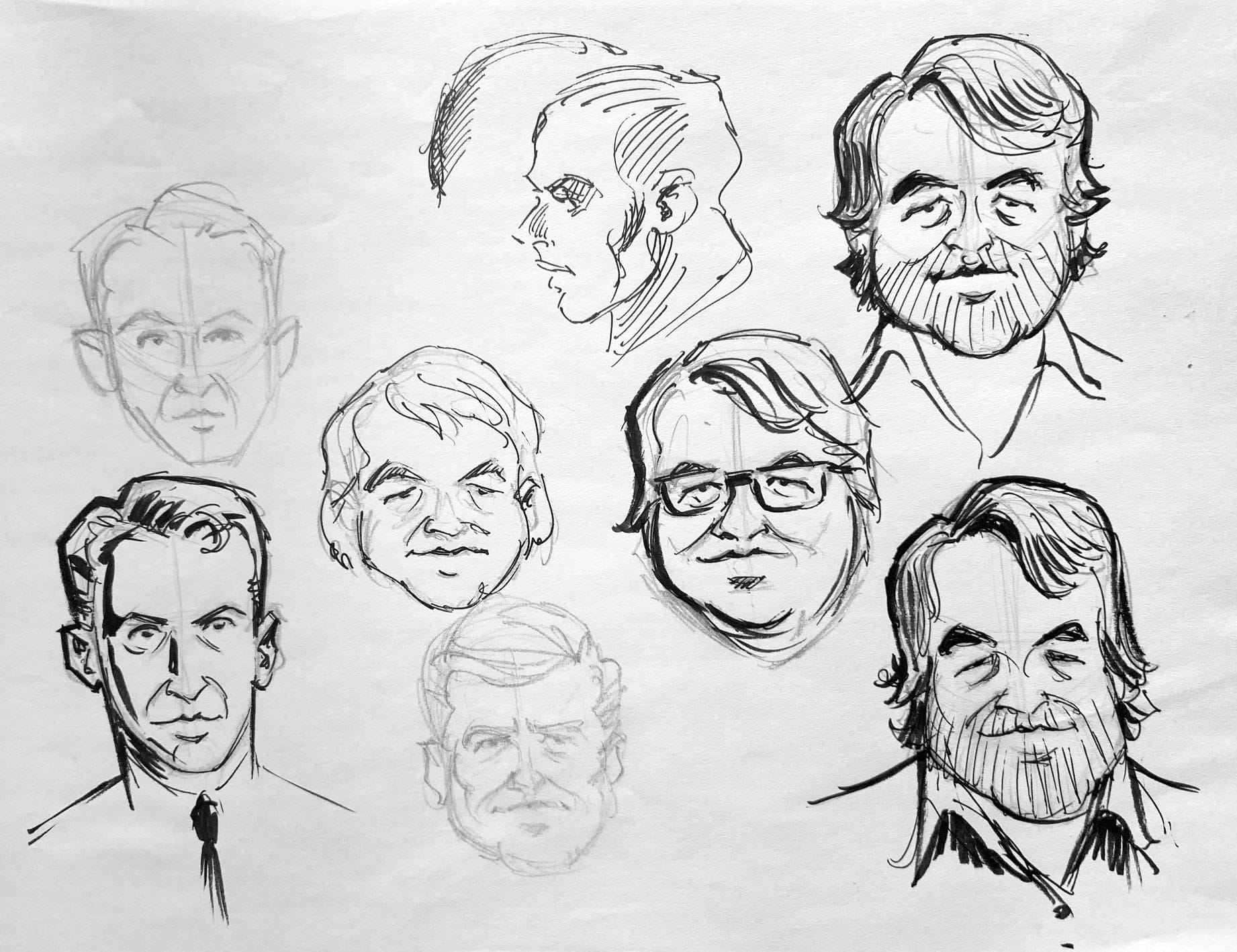
It really depends on the director. There are a number of approaches, some will simply give you a shot list and it’s a matter of interpreting that visually. Some will give you a shot list and then talk you through it in minute detail so there’s as little margin for error as possible. Then you get directors who give you a script, maybe a mood board or some sense of the set or location and just let you get on with it yourself and go wild. Then you get directors who like to act the whole thing out for you which can be quite funny.
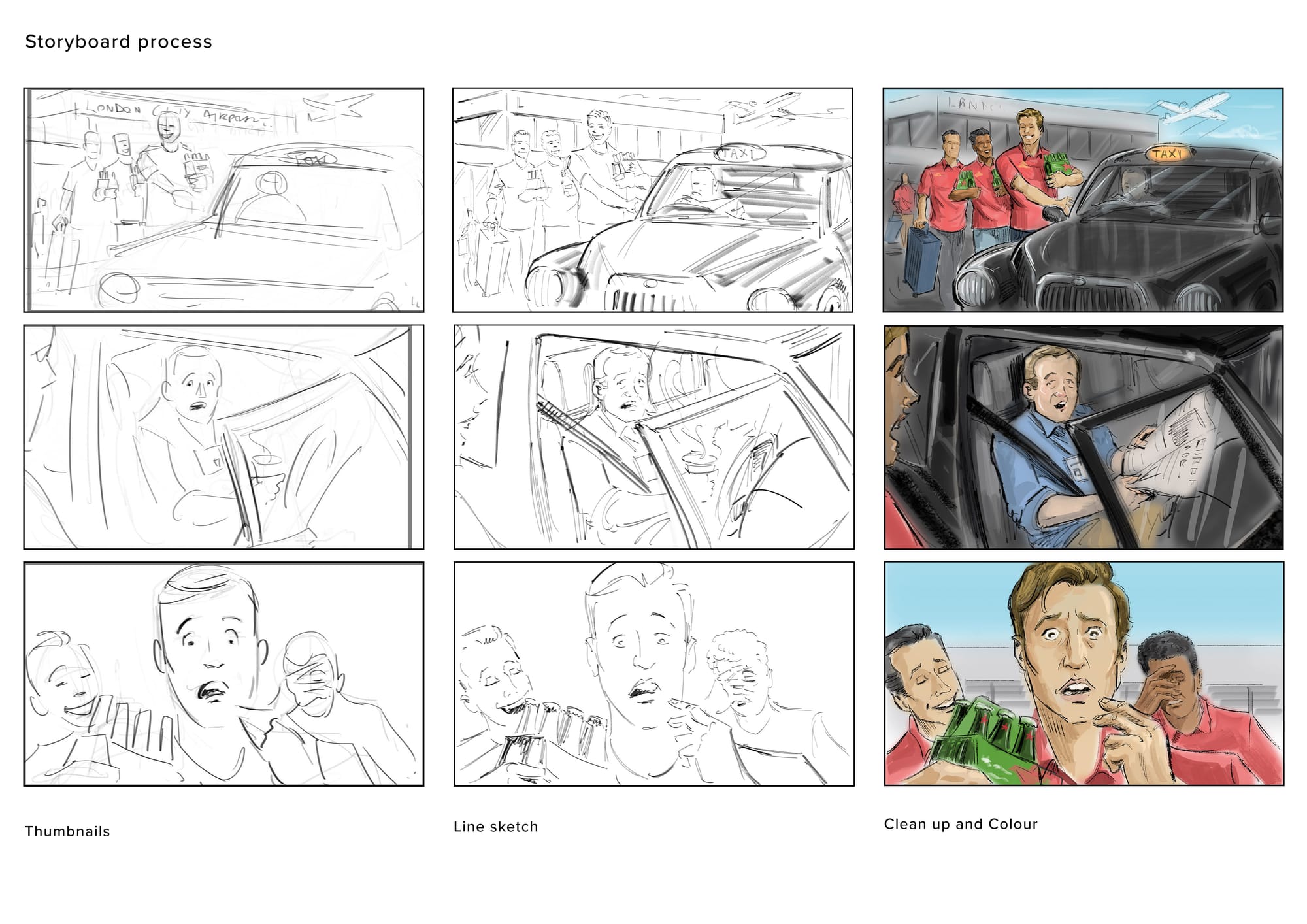
Probably my favourite approach is the directors who come to you with their own rough thumbnail storyboards and are basically asking you to help clean that up and present it with all the style you can muster. I can’t understand how you can generate a shot list without doing thumbnails. I’ve tried it and find it impossible because you are trying to interpret a visual image you have in your head down into writing, then reinterpret that back into a visual form. I just don’t see shots clearly enough in my head to be able to take notation, I have to figure it out to some extent on paper. Well maybe that’s why I’m not a director.
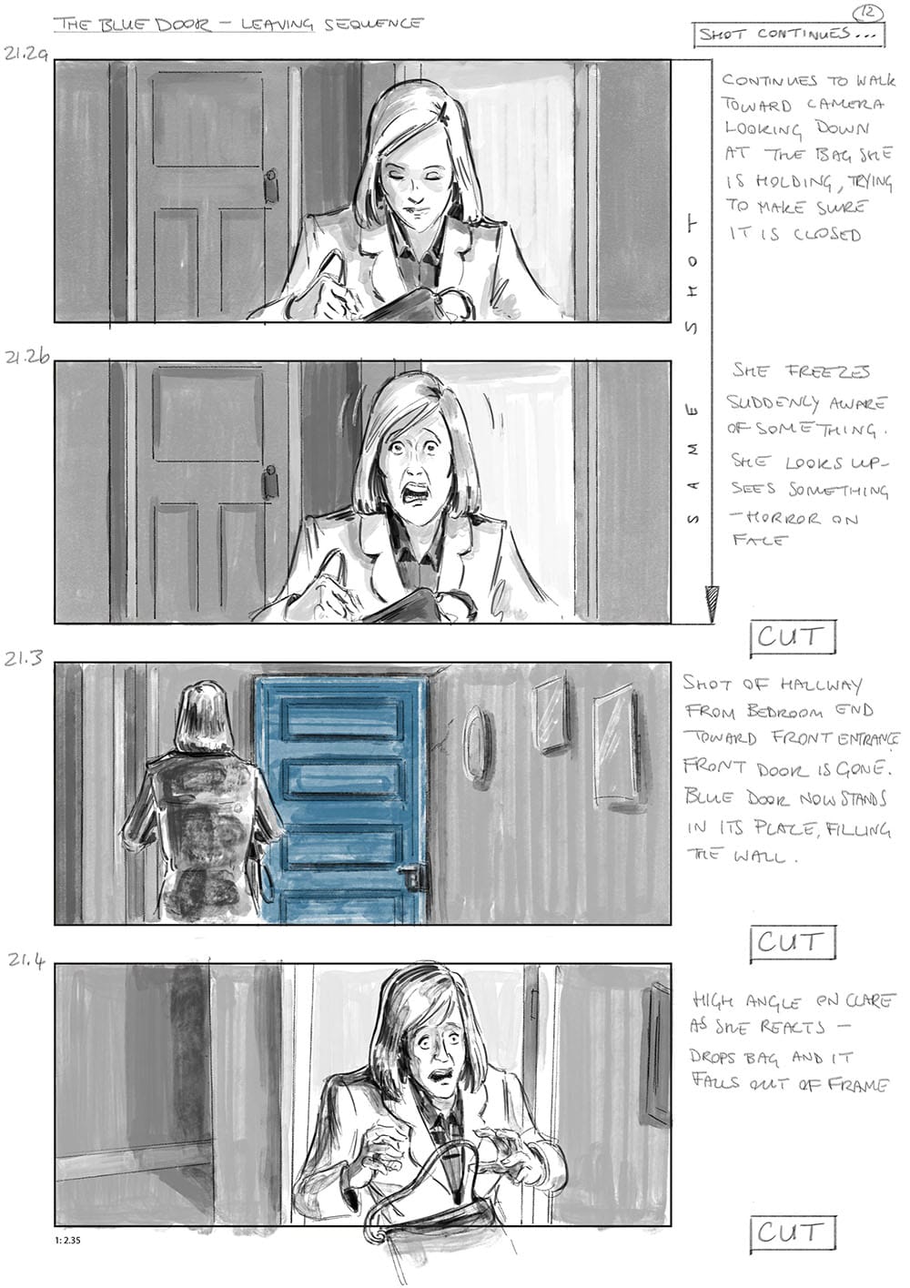
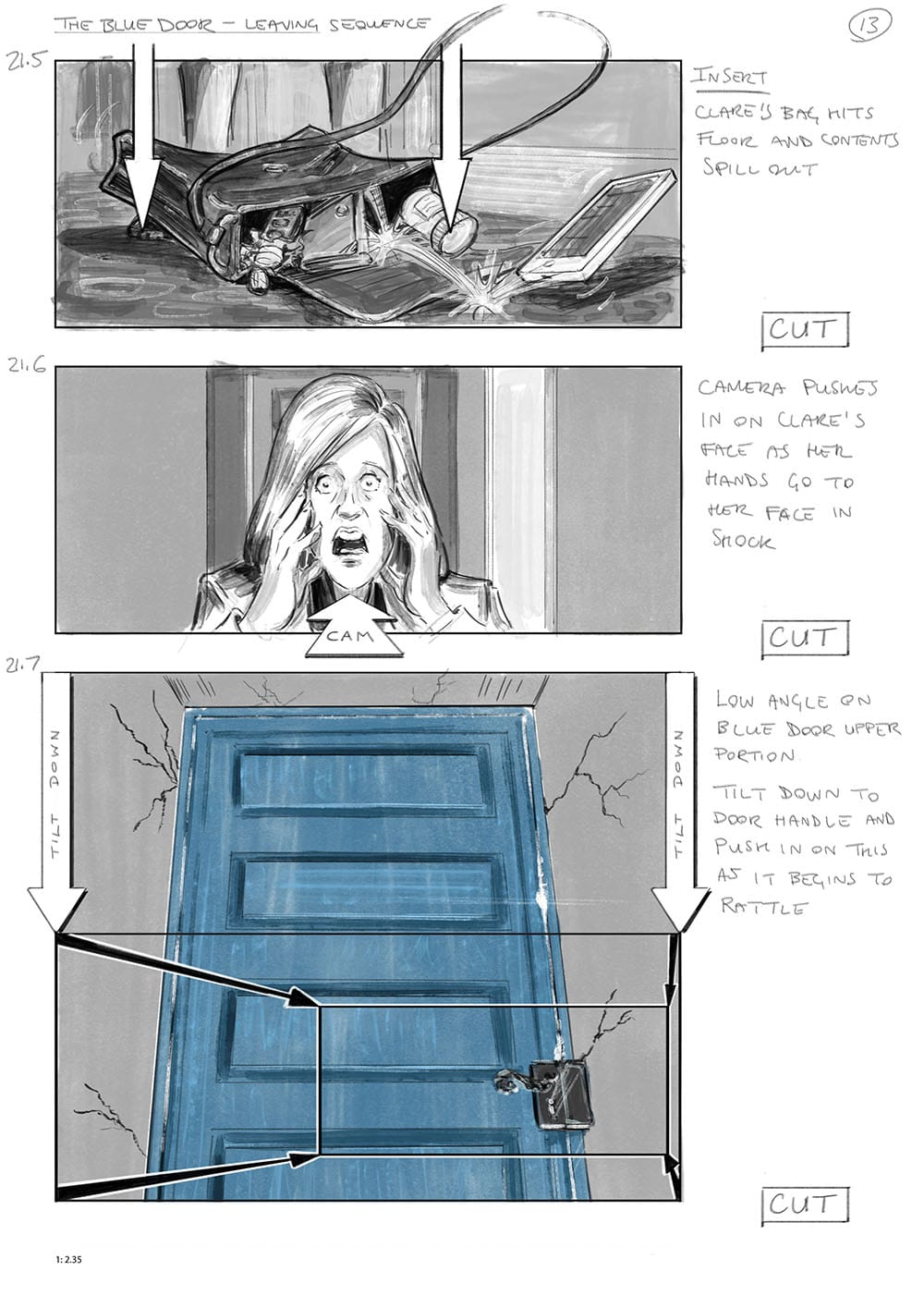
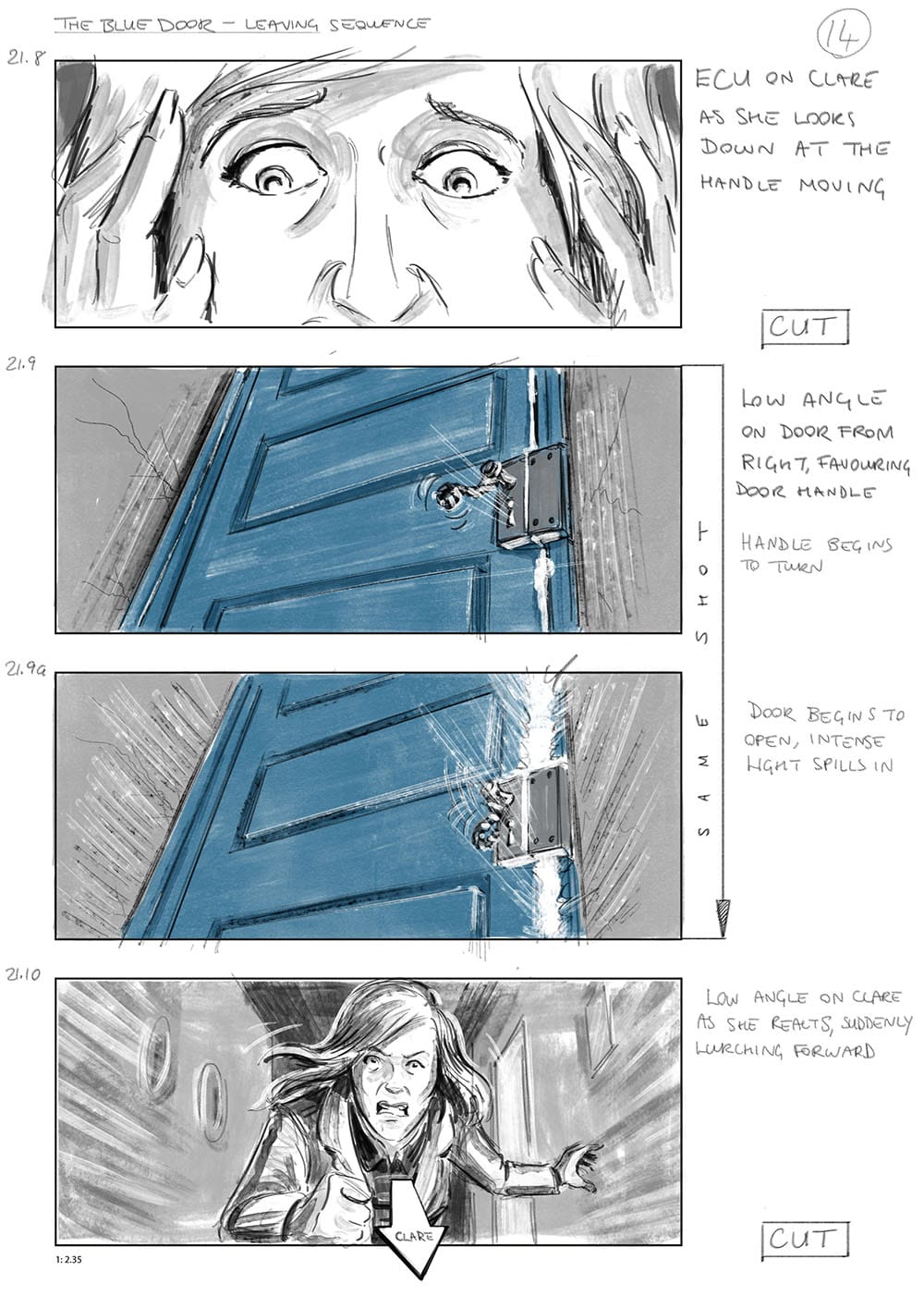
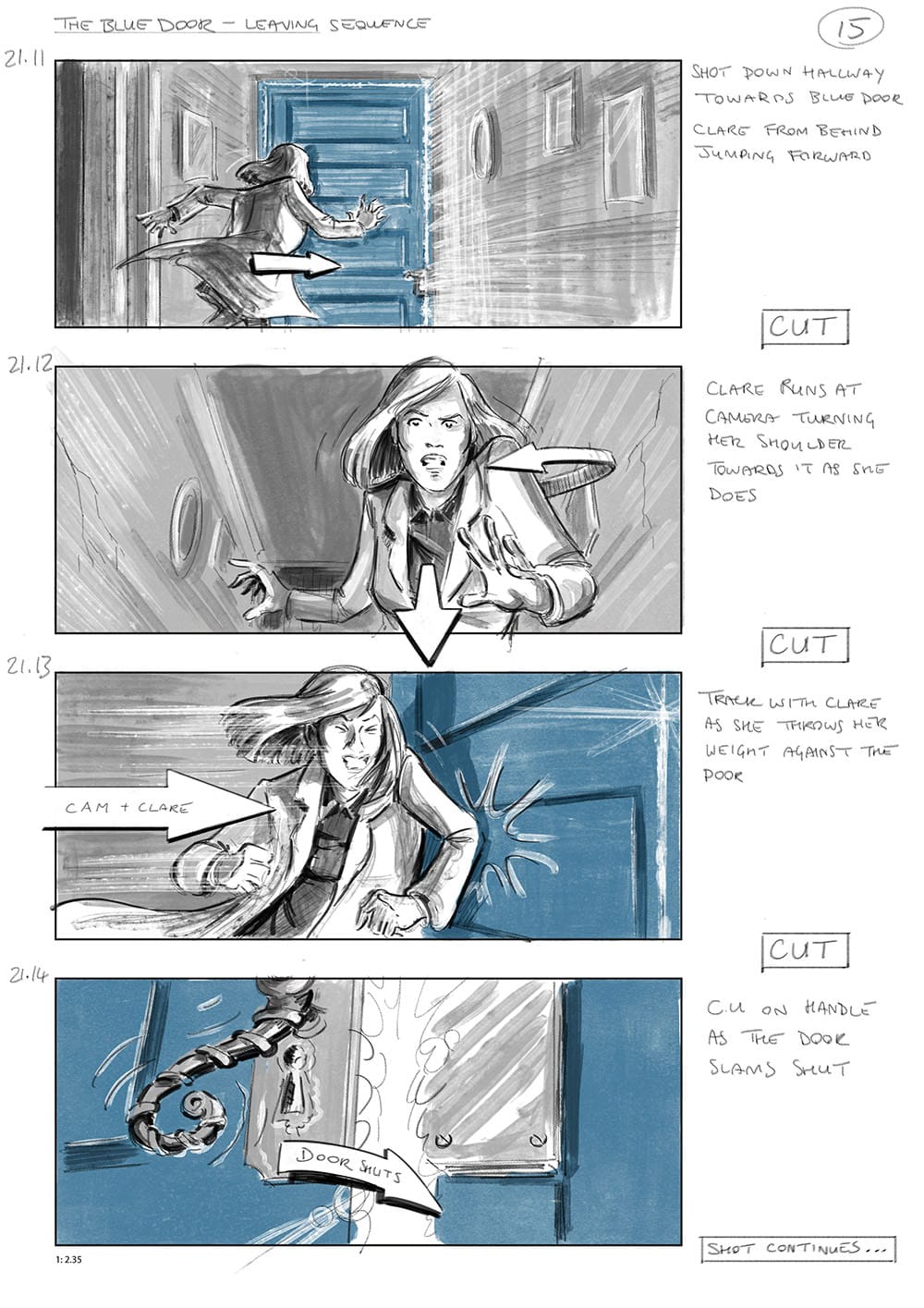
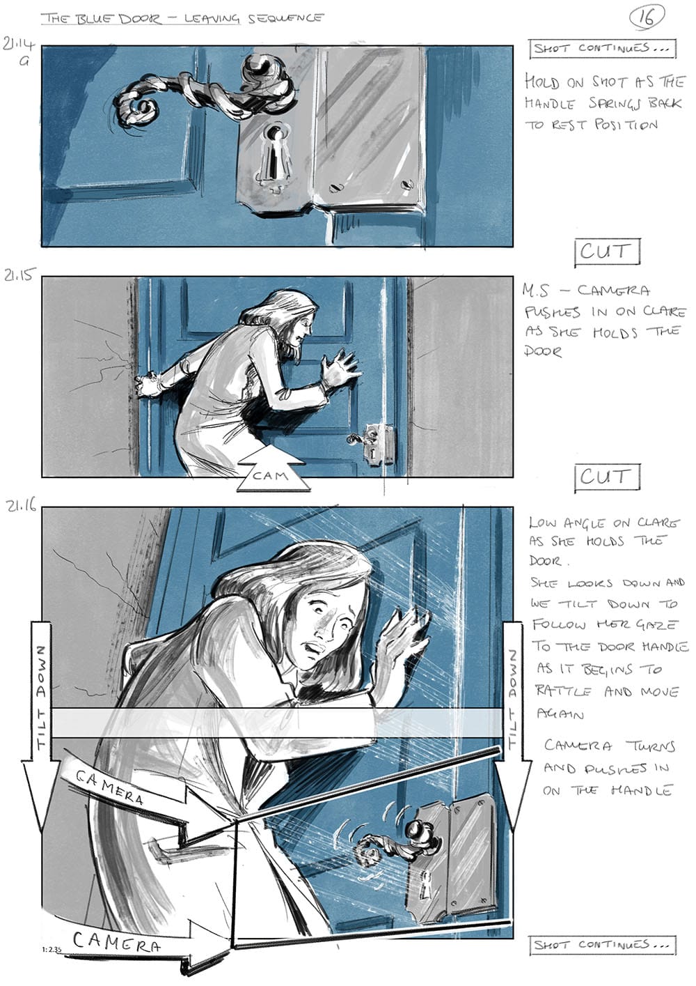
How do you approach a scene or an image and translate it into a storyboard? What is your process of translating it into cinema language. What are the considerations?
I think you have to start by trying to understand what the purpose of the scene is, what it is that the writer is trying to convey and then it’s a matter of choosing a visual approach that will support that.
You’ve almost got a menu of approaches to choose from. What kind of mood does the scene have, is it calm, is it dramatic, is it funny? If it’s a relaxing scene then dividing the shots up using horizontal lines tends to give that feeling that everything is placid and calm. If this is a dramatic scene, an action scene then you might want most of your shots to use more diagonal lines, you might want to make more use of perspective or suggest a canted angle.
Then you could consider shape - for the romantic relaxing scene rounded shapes, ovals and circles are going to help accentuate that feeling, so you would suggest props or architecture that reflect that. If you're going for the dramatic action scene is there an opportunity to use more angular shapes, triangles and arrows in that environment to suggest danger or difficulty?
Then you look at the characters in the shots. If there are two characters in the scene and one is more dominant than the other how do you convey that? The most obvious way is to place the dominant character higher in the frame. You can do that through staging, by positioning them at the top of some stairs and the other person at the foot of the stairs. You might do it by placement of the camera, shooting the dominant character from a slightly lower angle making them appear taller, more domineering and shoot the other character from a slightly higher angle.
You also need to think of the focal point of a shot, what are we directing the audience to look at? Once that thing, whether it be an object or person is identified you can highlight it by framing it by whatever is on hand in that location. It may be a piece of architecture, an archway or window framing a character, or it may be lighting or the arrangement of objects or other people or whatever.
You can also focus attention on something by almost pointing at it, using objects in the location and positioning them almost like arrows so they point at the area you want the audience to pay attention to. Another approach is to place your focal point at the vanishing point of naturally occurring lines of perspective, so all the lines in the environment appear to point at the object or character you are trying to highlight.
You just continue in that way with every shot asking yourself what information or feeling is supposed to be conveyed here. It sounds like a somewhat mechanical and dry process, but really a lot of that stuff is intuitive. It’s really only if you get stuck at any point that you actually stop and think in terms of composition, shapes, lighting etc. at such a conscious level.
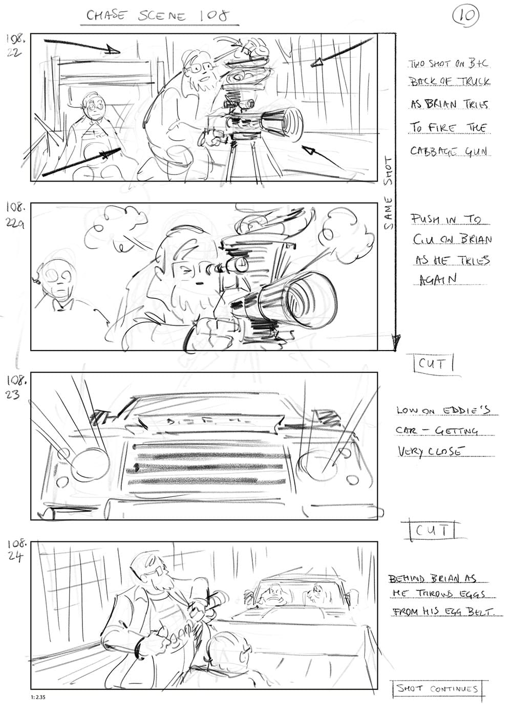
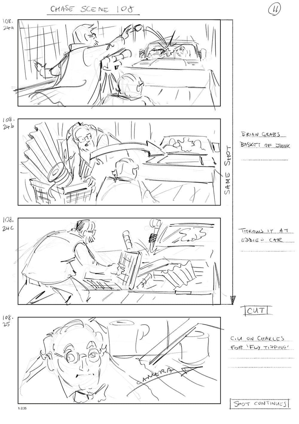
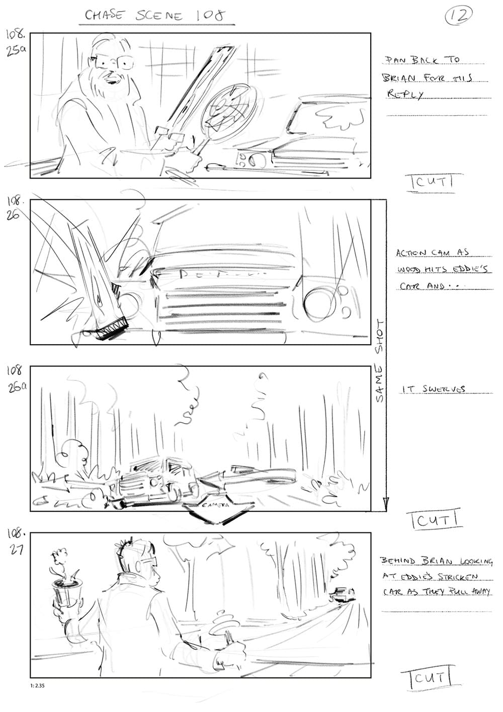
Storyboards for Brian & Charles, Universal Pictures, 2022
When you're watching a film, are you in synch with the choices in terms of the storyboards? Are you anticipating the staging and shot selection?
No I’m completely in a different headspace usually when watching a film. I’m taking it all in visuals, music, dialogue, story. Like anyone else watching a film I’m doing it for entertainment.
I have to consciously flick a switch inside my head before I start seeing composition, camera movement, all those visual components. Sometimes if I’ve been working on a particular board with a particular style and then I watch a film that awareness of the filmmaking tricks can creep in and really spoil the experience in some ways.
So many projects that are initiated never see the light of day, for a multitude of reasons, how do you keep the faith that your work will be seen, or is that not a consideration?
I think it’s mostly the latter for me. I’m so used to things I work on not seeing the light of day, and that includes within the world of marketing - I’m always surprised if something does make it into the world. For the advertising and marketing visuals, I mean they might be realised, but even then only the finished product will really be seen by the public, my input is usually just at the pitch stage, it’s only seen by people in the boardrooms, and I’m ok with that.
You’ve got to enjoy the process itself I think and know that it will be appreciated by a very small audience within that particular workplace. I’ve worked on a few personal projects and that’s more difficult. You are trying to sell an idea that may be quite personal to you. If it doesn’t get picked up is it because the idea wasn’t good enough or your visual presentation wasn’t good enough? Either way it's difficult not to have your self-confidence tested by that.
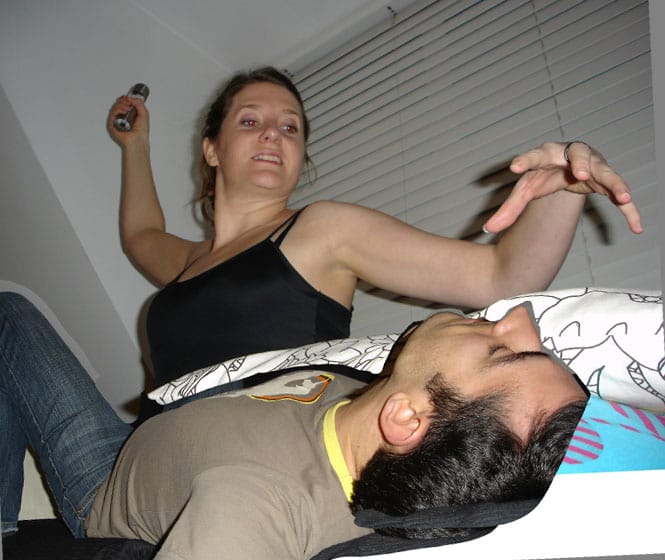
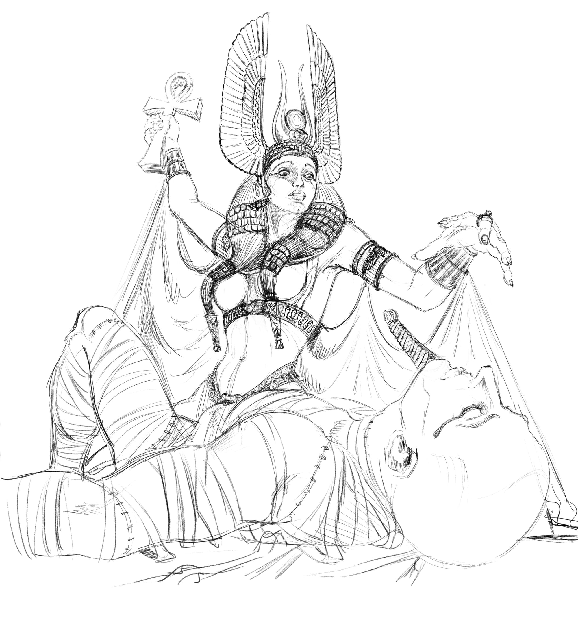
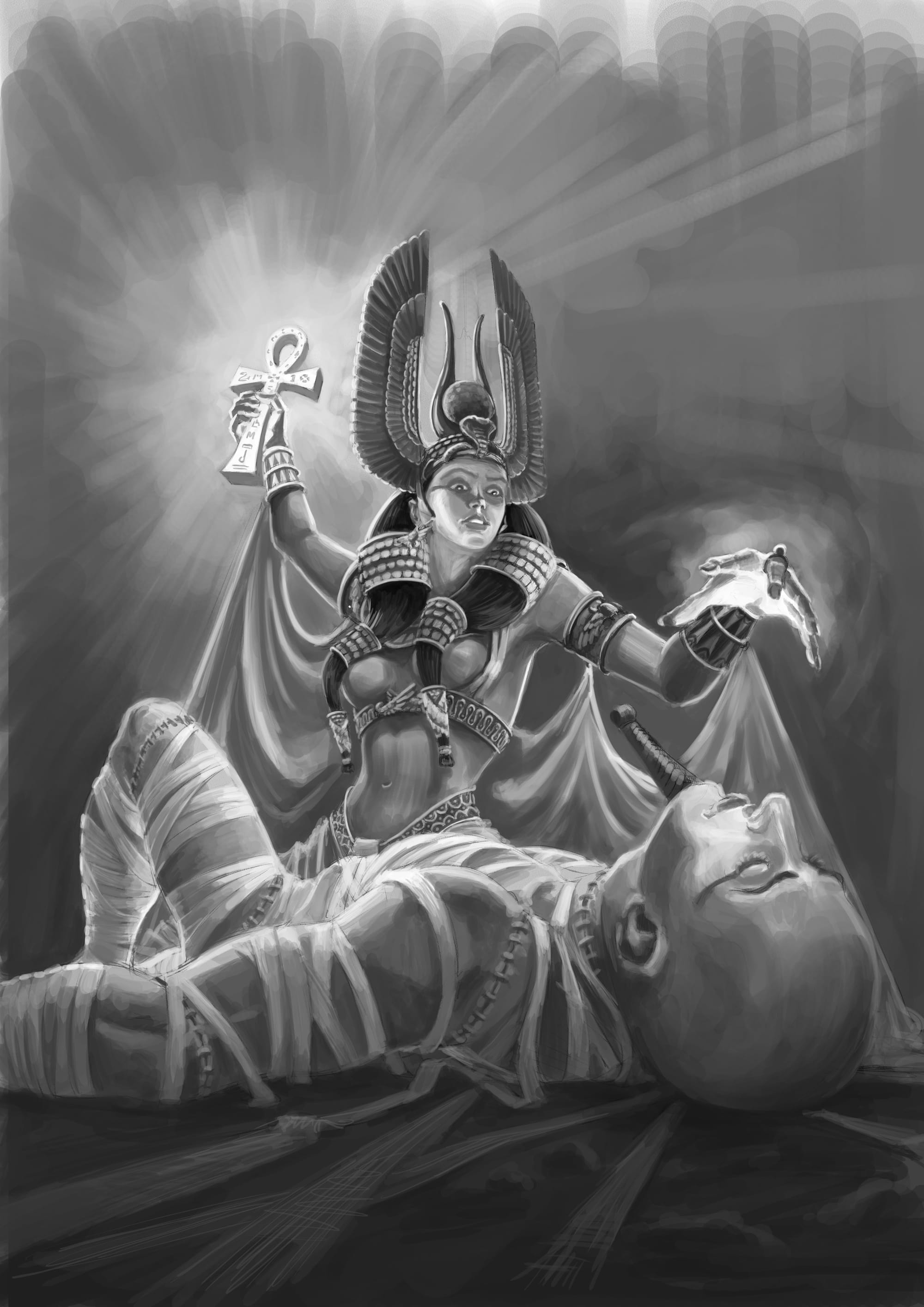
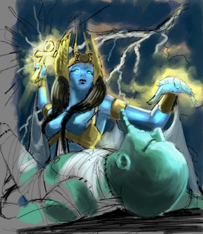
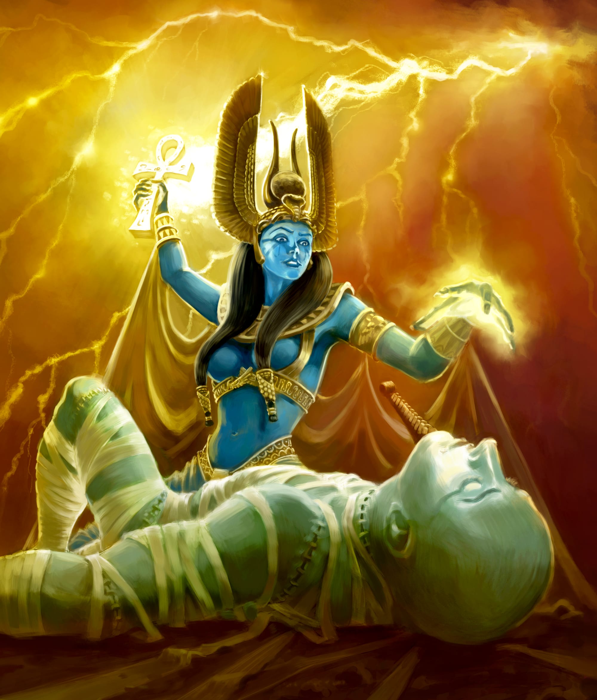
Reference to final - Isis & Osiris
How have you refined your style, or your voice, over time or has it always been there?
Ha! Still a work in progress, I’m afraid. I’m pretty stylistically promiscuous. I never really sought a style, I didn’t realise that was something that was desirable in art and illustration until I was at art college and tutors started talking about ‘developing a style’.
Until then I’d aimed for versatility, adapting my style depending on the subject of the artwork I was working on. I guess as a kid I was used to emulating different styles, so I would adopt a style in the service of the subject matter in much the way a director might cast an actor for a role.
What I discovered was that in the design industry the illustrator is usually seen by Art directors as the actor. Film directors are looking for someone with a particular look or attitude and art directors are looking for a particular style and they choose their illustrators based on the style they’ve seen illustrators produce in the past.
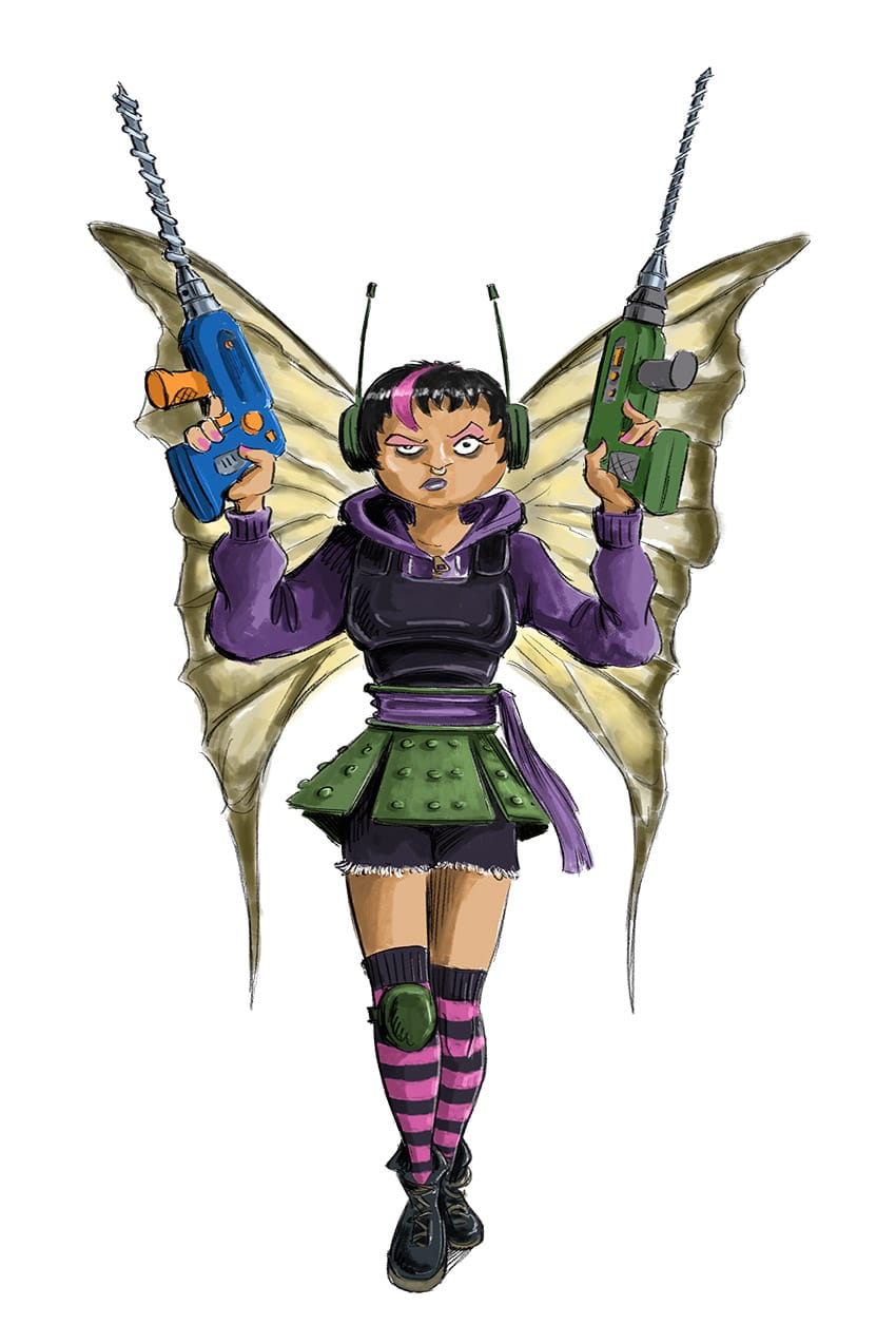
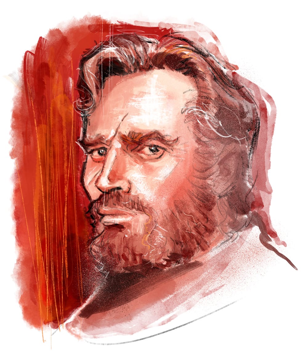
I’ve compromised in recent years by almost creating different personas, by splitting the work into three separate portfolios. There’s one for the storyboarding, concept art and character design, pastiche work and then there’s another for what I consider to be ‘me’ I suppose.
What's the single greatest or most valuable lesson you have learned about your craft?
I’m going to say the principle of “Rule of thirds”. This will sound really stupid because it’s such a simple and prosaic thing, but I really knew nothing about it through school, or art college. Maybe it was taught but I just wasn’t paying attention that day.
Anyway I didn’t learn about it until I started seeking out books on composition when I was getting into illustration for real. It was a true revelation. It's not that I wasn’t composing images in that format already, in many instances I was, it’s just I was doing it through a kind of osmosis, because I was so familiar with its use in film. I couldn’t have articulated why these compositions seemed better to me, I had no idea it was related to visual balance. Learning about that, and many other fundamental rules of composition really helped in terms of giving me confidence in the images I was producing. It gave me a ‘go to’ technique for compositions if I had no other ideas.
To anyone at the start of their illustration journey, what advice would you give to them?
I’m going to go with Joseph Campbell and his “Follow your Bliss” concept. To put it in an illustration context illustrator Wouter Tulp, who is amazingly versatile working in Character Design, caricature, book illustration, in a variety of styles says:
“Do what you love, however crazy it may seem. If you create from your heart what you do is never wrong.”
So if you are totally fulfilled drawing only fish using only a pink crayon – fantastic do that! If you have itchy feet and you want to try animal portraits in oil paints one day and then digital architectural images another, that’s fine too. You might have to think a little harder about how you market those different skills, but don’t let yourself be restrained. Whatever you do don’t go looking for a style, or at least don’t look for a money making style. Don’t take up collage just because collage is ‘in’ at the moment. That way lays madness, or at least unhappiness.
And there we go - we made it! That was a wonderful, deep and insightful dive into Leighton's creative journey. So many great links in there to references and influences - it's so great to talk to a creative who is in tune and open with their influences. We encourage you all to go explore those artists that have helped shape Leighton and enrich your palette with their incredible offerings.
And that's that, we suppose! Until the next time - keep exploring, keep creative and remember.
Be wild, be free.
Further Reading
